Fintech

String

With user-centered approach, the goal was to create an intuitive interface for effortless financial management while incorporating gamification.

Visit Site

Teal Flower
Teal Flower
Teal Flower
Teal Flower

Industry

Industry

Fintech
Fintech

Headquarters

Headquarters

San Diego, CA
San Diego, CA

Role

Role

UX Contract
UX Contract

Company size

Company size

Under 10
Under 10

String Checkout

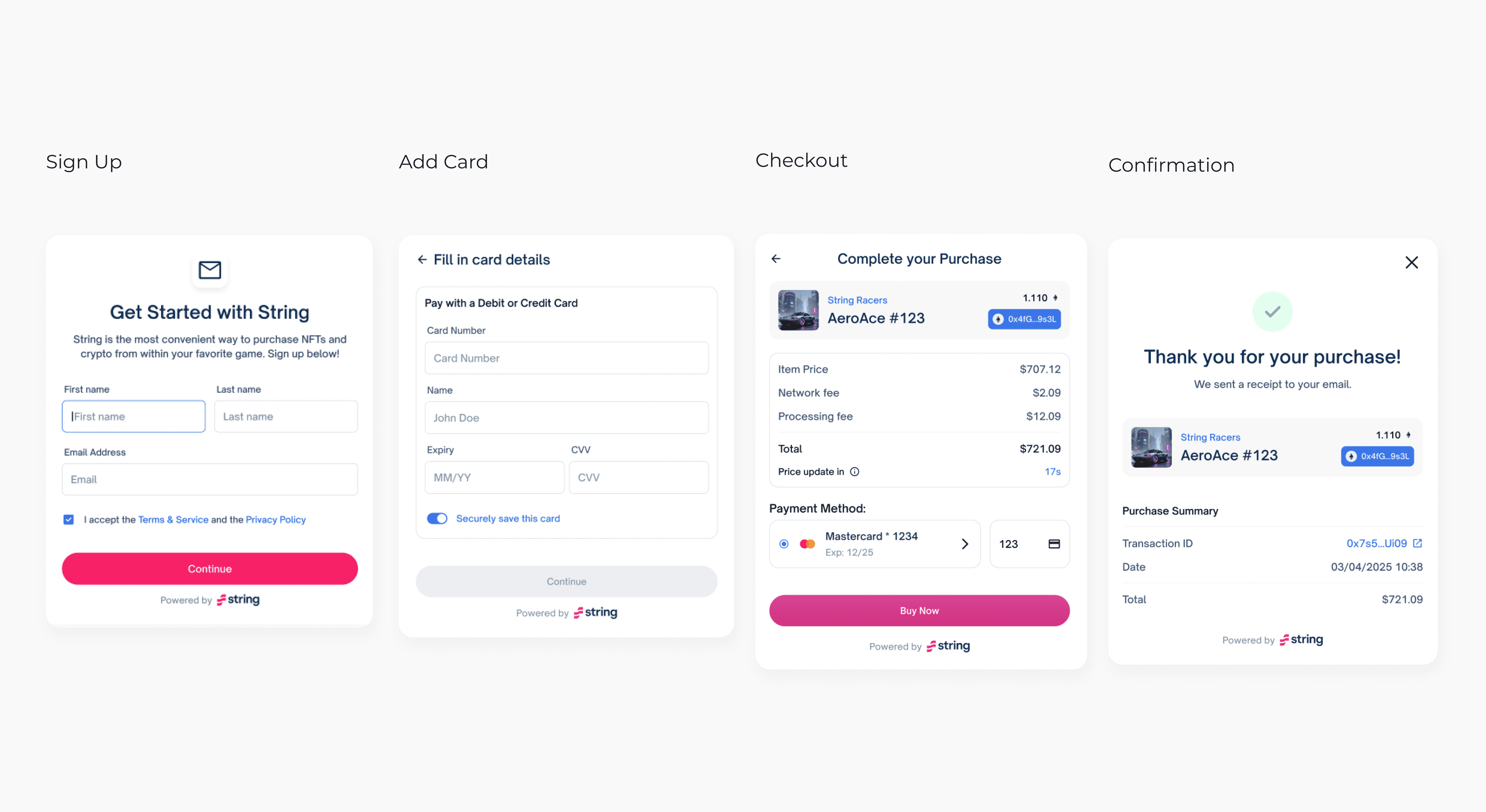
String Checkout introduces a frictionless, end-to-end payment experience. When players opt to pay with their cards, a sleek payment modal seamlessly loads within an iframe, guiding them through the entire process—from transaction to confirmation. String Checkout also ensures security by being fully PCI-compliant, so sensitive payment details are handled safely.

Developer-Friendly Integration

Designed as a turnkey solution, String Checkout can be integrated within a day. The open-source Web SDK is compatible with popular frontend frameworks like Svelte and React, allowing developers to easily embed a "Buy" button into the game UI. Once a player initiates a purchase, String Checkout takes over, handling the entire process with minimal developer effort.

I worked as the sole designer on this project, bringing the MVP from concept to production.

User Journey Research

Key Findings:

  1. Discovery: Users needed an easy way to compare the onramp service with competitors. The inability to fully test features before committing made them anxious and less willing to engage.


  2. Registration Pains: Users expressed frustration over the complex signup process. They wanted fewer upfront fields to fill, allowing quicker access to the sandbox environment.


  3. Admin Panel Complexity: A confusing admin panel hindered users from feeling in control, particularly around API key management and team onboarding. This led to a lack of confidence in the platform’s security.


  4. Security Concerns: Developers and business owners prioritized API key security but wanted additional features like OTP (One-Time Password) to enhance protection against unauthorized access.
Competitive Analysis

During the competitive analysis of NFT onramp solutions, I discovered key strengths and weaknesses across three platforms—Paper.xyz, Sendwyre, and Stripe.

Paper.xyz offered a simple, privacy-focused onboarding experience but lacked post-sign-up guidance, leaving users to navigate an overwhelming, text-heavy dashboard on their own.

Sendwyre provided a more structured onboarding flow, featuring helpful UI tutorials and a well-organized admin panel, though it suffered from vague error messages.

Stripe emerged as the standout for obvious reasons of having a seamless onboarding process, intuitive navigation, and well-crafted error messaging that guided users effortlessly.

Across the board, we identified opportunities to enhance user education, improve error handling, and create more visual guidance for complex processes. These insights shaped the direction of our design, focusing on what's to come ahead.


SWOT Analysis

This exercise further strengthened that split experiences between advanced and regular users are becoming the norm for Web3 projects whose products have multiple layers of offerings. This allows for a more customized and fluid experience by giving less of importance to advanced tools that are not relevant to all users.


User Flows

We sought other onboarding alternatives on top of verifying their identity via email. Streamlining the verification process with an in-app verification option would increase onboarding rates and reduce friction for power users looking to test their payment API integration.